Basic Raster Styling and Analysis
A lot of scientific observations and research produces raster datasets. Rasters are essentially grids of pixels that have a specific value assigned to them. By doing mathematical operations on these values, one can do some interesting analysis. QGIS has some basic analysis capabilities built-in via Raster Calculator. In this tutorial, we will explore basics on using Raster Calculator and options available for styling rasters.
Overview of the task
We will use population density grid data to find and visualize areas of the world that have seen dramatic population density change between year 1990 and 2000.
Other skills you will learn
- Selecting and loading multiple datasets in a single step in QGIS.
Get the data
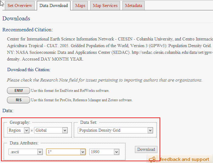
We will use the Gridded Population of the World (GPW) v3 dataset from Columbia University. Specifically, we need the Population Density Grid for the entire globe in ASCII format and for the year 1990 and 2000.
Here is how to search and download the revelant data.
- Go to the Population Density Grid, v3 download page. Select the Data Attributes as .ascii format, 1° resolution and 1990 year. Click Download. At this point, you may create a free account and login, or use the Guest Download button at the bottom to immediately download the data. Repeat the process for 2000 year data.
You will now have 2 zip files downloaded.
For convenience, you can also download a copy of this data by clicking on following links:
Procedure
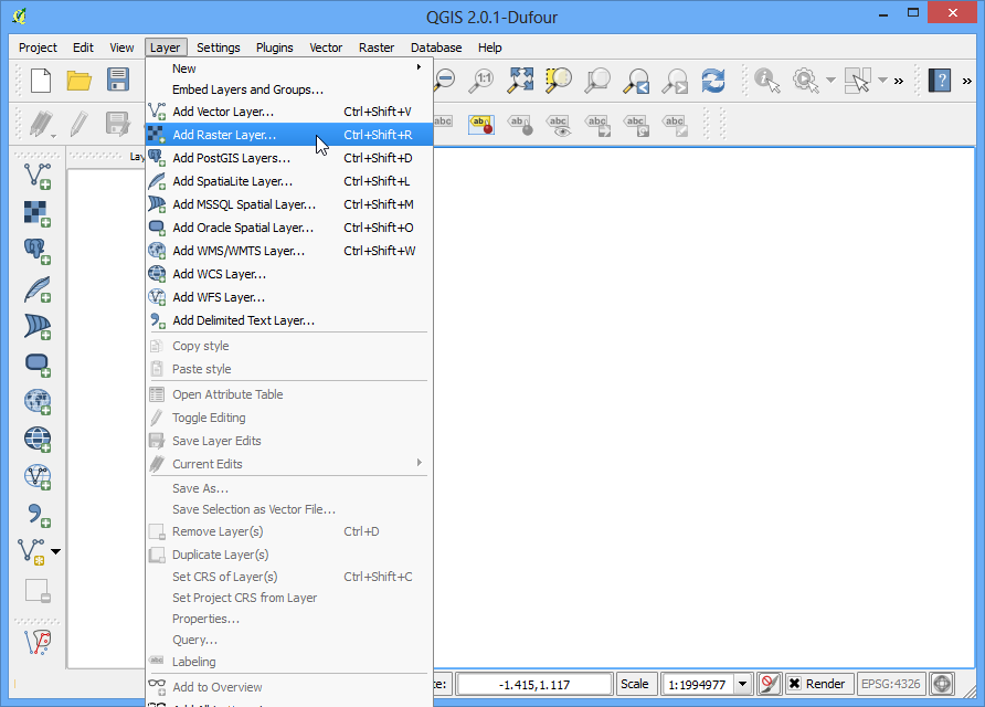
- Open QGIS and go to Layer ‣ Add Raster Layer...
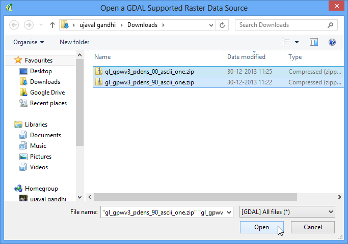
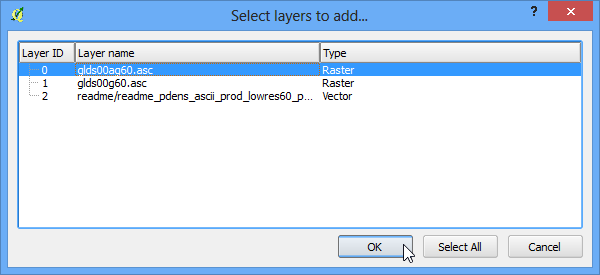
- Locate the downloaded zip files. Hold down the Ctrl key and click on both the zip files to select them. This way you are able to load both the files in a single step.
- Each zip file contain 2 grid files. The a in the filename suggests that the population counts were adjusted to match the UN totals. We will use the adjusted grids for this tutorial. Select glds00ag60.asc as the layer to add. Click OK.
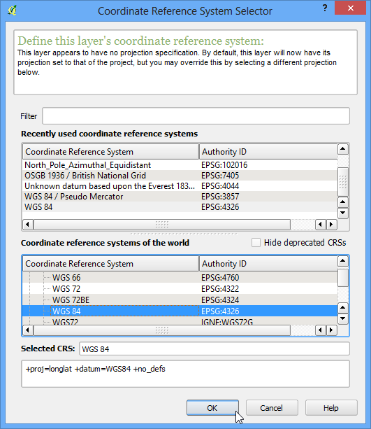
- The layer doesn’t have a CRS defined, and since the grids are in lat/long, choose EPSG:4326 as the coordinate reference system.
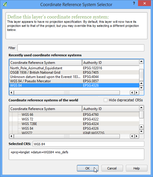
- Since we selected both the zip files, you will see similar dialogs once again. Repeat the process and select glds90ag60.asc grid as the layer to add.

- Once again, choose EPSG:4326 as the CRS.
- Now you will see both the rasters loaded in QGIS. The raster is rendered as in grayscale, where darker pixels indicate lower values and lighter pixels indicate higher values.
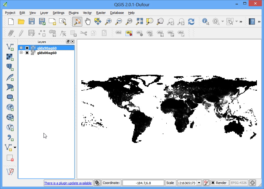
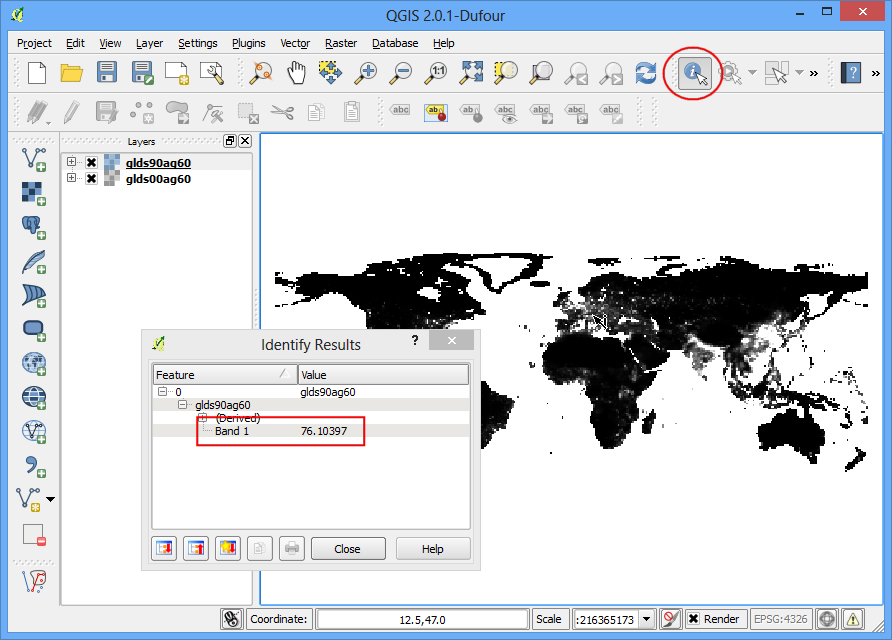
- Each pixel in the raster has a value assigned. This value is the population density for that grid. Click on Identify Features button to select the tool and click anywhere on the raster to see the value of that pixel.
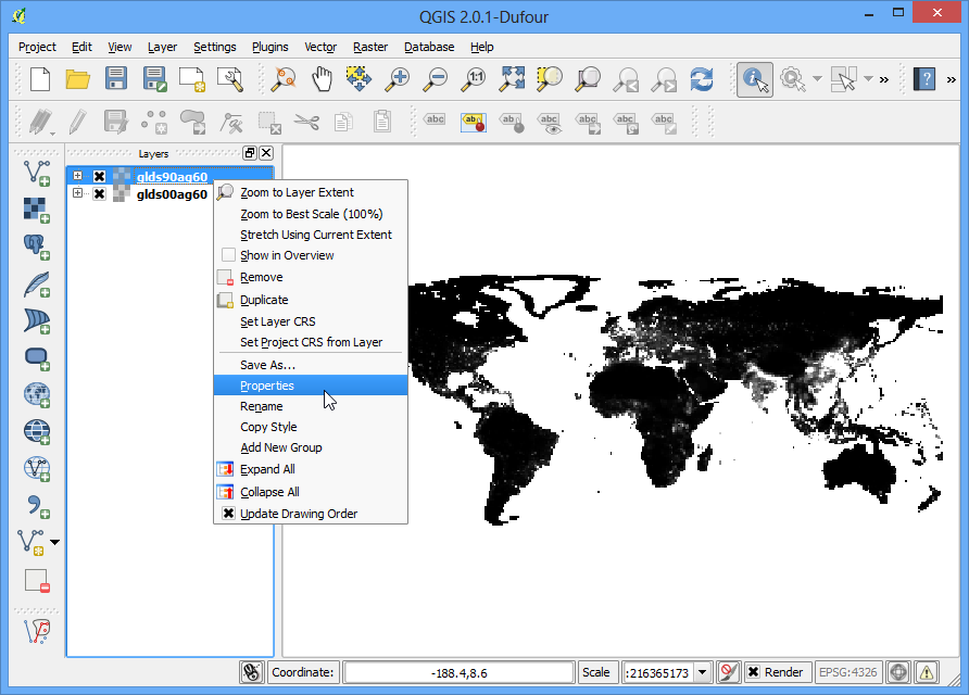
- To better visualize the pattern of population density, we would need to style it. Right-click on the layer name and select Properties. You can also double-click on the layer name in the TOC to bring up the Layer Properties dialog.
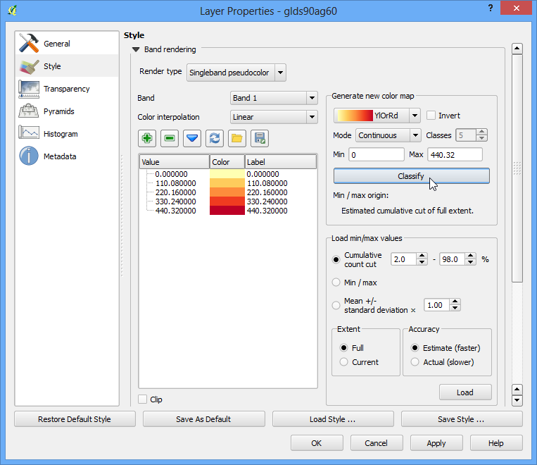
- Under the Style tab, change the Render type to Singleband pseudocolor. Next, click Classify under Generate a new color map. You will see 5 new color values created. Click OK.
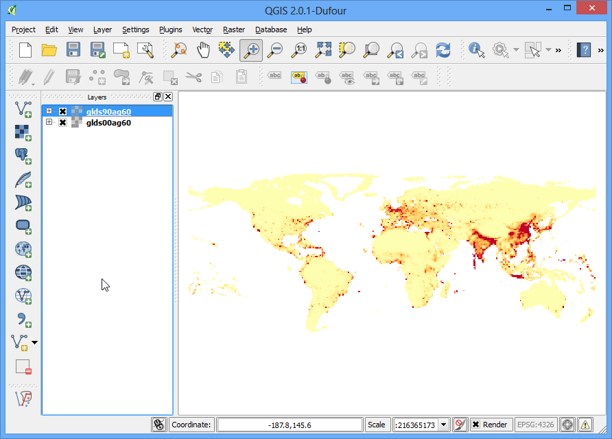
- Back in the QGIS Canvas, you will see a heatmap-like rendering of the raster. Repeat the same process for the other raster as well.
- For our analysis, we would like to find areas with largest population change between 1990 and 2000. The way to accomplish this is by finding the difference between each grid’s pixel value in both the layers. Select Raster ‣ Raster calculator.
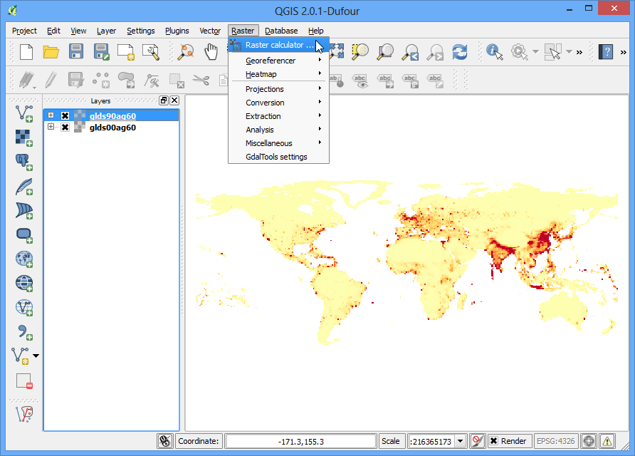
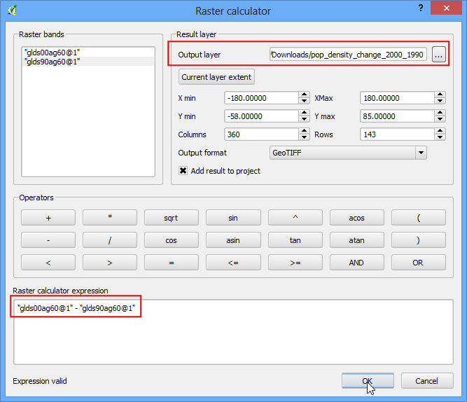
- In the Raster bands section, you can select the layer by double-clicking on them. The bands are named after the raster name followed by @ and band number. Since each of our rasters have only 1 band, you will see only 1 entry per raster. The raster calculator can apply mathematical operations on the raster pixels. In this case we want to enter a simple formula to subtract the 1990 population density from 2000. Enter glds00ag60@1 - glds90ag60@1 as the formula. Name your output layer as pop_density_change_2000_1990.tif and check the box next to Add result to project. Click OK.
- Once the operation is complete, you will see the new layer load in QGIS.
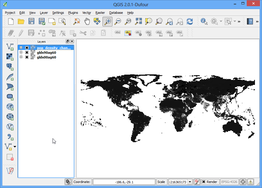
- This grayscale visualization is useful, but we can create a much more informative output. Right-click on the pop_density_change_2000_1990 layer and select Properties.
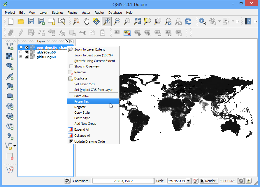
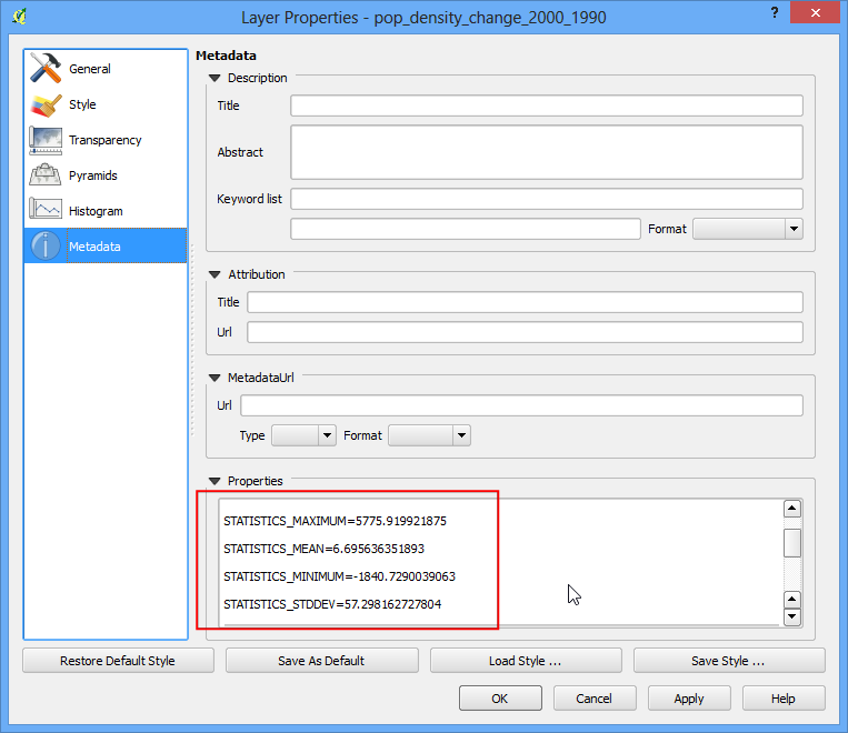
- We want to style the layer so pixel values in certain ranges get the same color. Before we dive in to that, go to the Metadata tab and look at the properties of the raster. Note the minimum and maximum values of this layer.
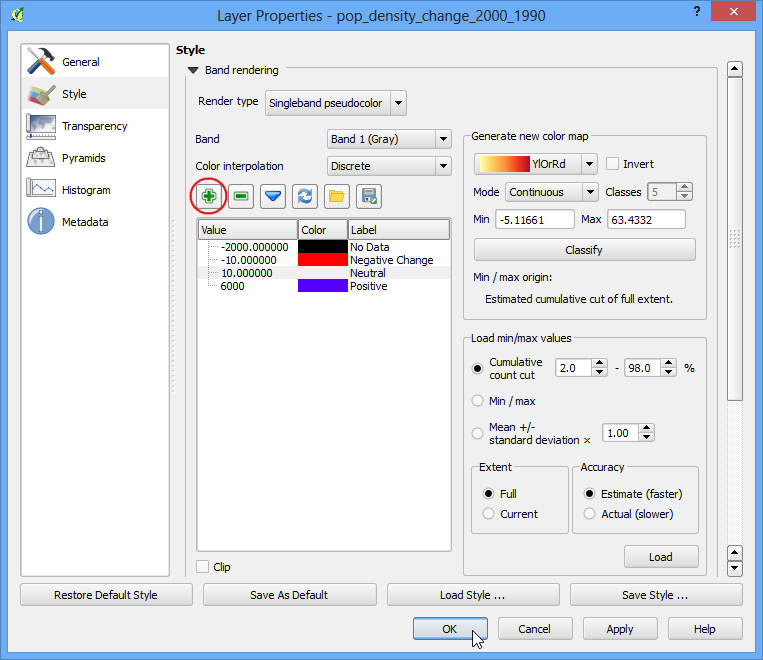
- Now go to the Style tab. Select Singleband pseudocolor as the Render type under Band Rendering. Set the Color interpolation to Discrete. Click the Add entry button 4 times to create 4 unique classes. Click on an entry to change the values. The way color map works is that all values lower than the value entered will be given the color of that entry. Since the minmum value in our raster is just above -2000, we choose -2000 as the first entry. This will be for the No Data values. Enter the values and Labels for other entries as below and click OK.
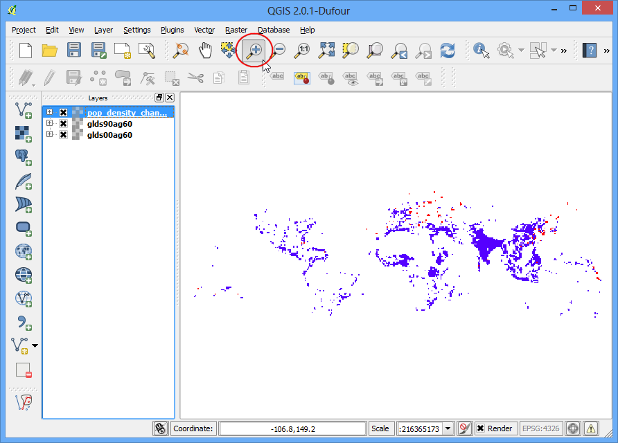
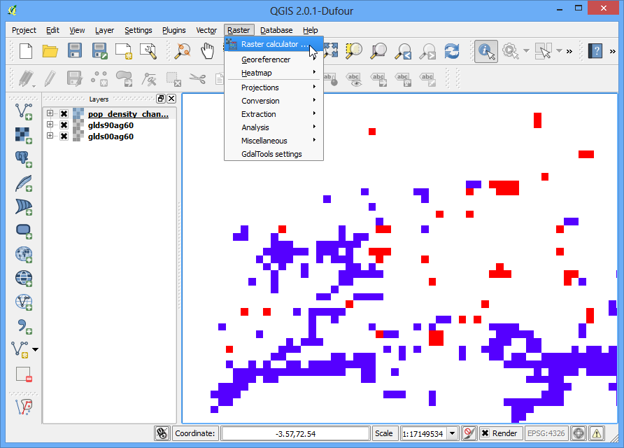
- Now you will see a much more powerful visualization where you can see areas which has seen positive and negative population density changes. Click on Zoom In button and draw a rectangle around Europe to explore the region in more detail.
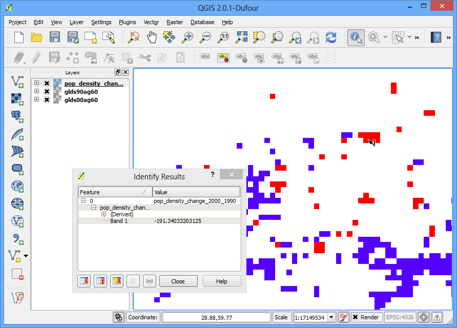
- Select the Identify tool and click on the Red and Blue regions to verify that your styling rules worked as intended.
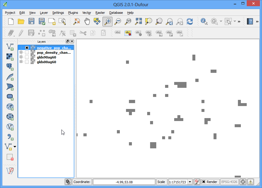
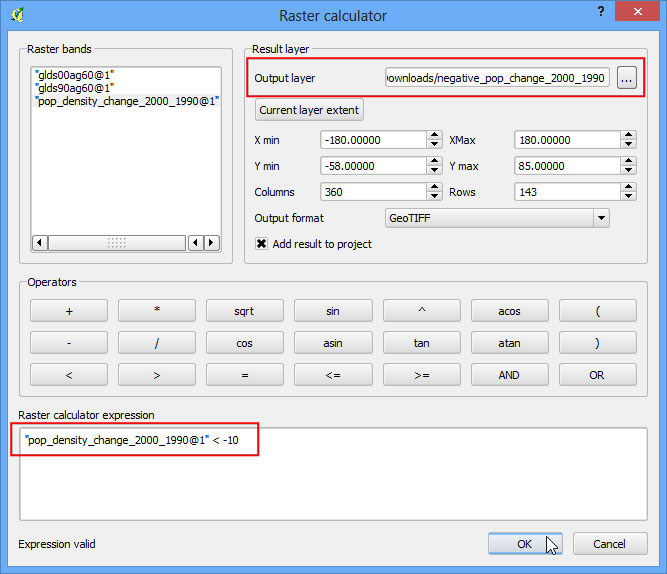
- Now let’s take this analysis one-step further and find areas with only negative population density change. Open Raster ‣ Raster calculator.
- Enter the expression pop_density_change_2000_1990@1 < -10. What this expression will do is set the value of the pixel to 1 is if matches the expression and 0 if it doesn’t. So we will get a raster with pixel value of 1 where there was negative change and 0 where there wasn’t. Name the output layer as negative_pop_change_2000_1990 and check the box next to Add result to project. Click OK.
- Once the new layer is loaded, right-click on it and select Properties. In the Transparency tab, add 0 as the Additional no data value. This setting will make the pixels will 0 values also transparent. Click OK.
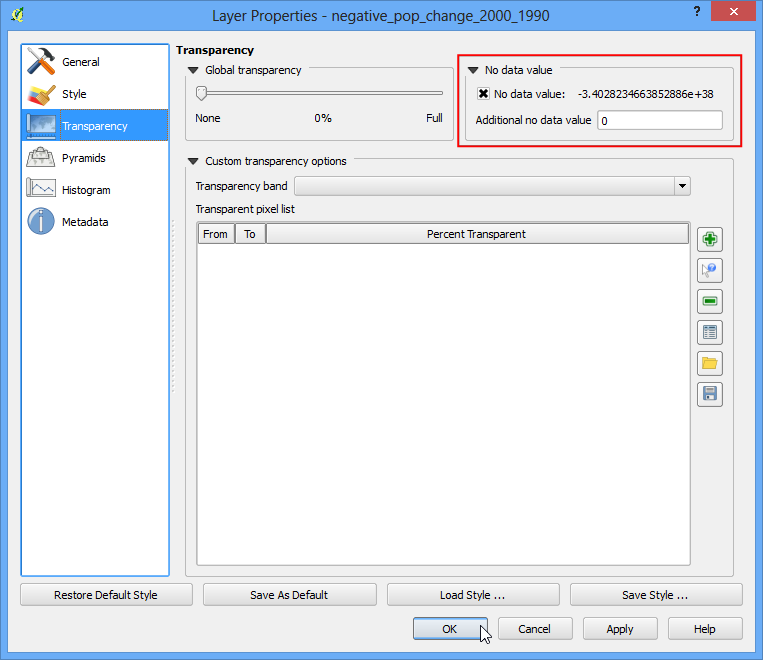
- Now you will see the areas of negative population density change as gray pixels.