Animating Time Series Data (QGIS3)
Time is an important component of many spatial datasets. Along with location information, time providers another dimension for analysis and visualization of data. If you are working with dataset that contains timestamps or have observations recorded at multiple time-steps, you can easily visualize it using the TimeManager plugin in QGIS. TimeManager allows you to view and export
‘slices’ of data between certain time intervals that can be combined into animations.
Overview of the task
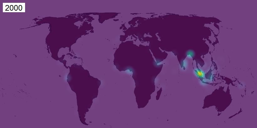
We will take a point layer of maritime piracy incidents, create a heatmap visualization and create an animation of how the piracy hot-spots have changed over past 2 decades.
Other skills you will learn
- Using the Heatmap renderer for quick visualization of dense point data
- Creating and using custom map projections
Setup
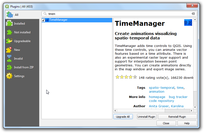
Go to . Search for and install the TimeManager plugin.
Procedure
- In the QGIS Browser Panel, locate the directory where you saved your downloaded data. Expand the
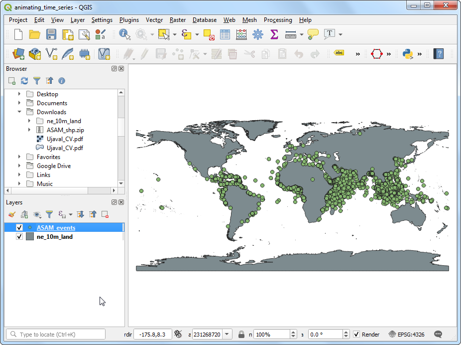
ne_10m_land.zip and select the ne_10m_land.shp layer. Drag the layer to the canvas. Next, locate the ASAM_shp.zip file. Expand it and select the asam_data_download/ASAM_events.shp layer and drag it on to the canvas.
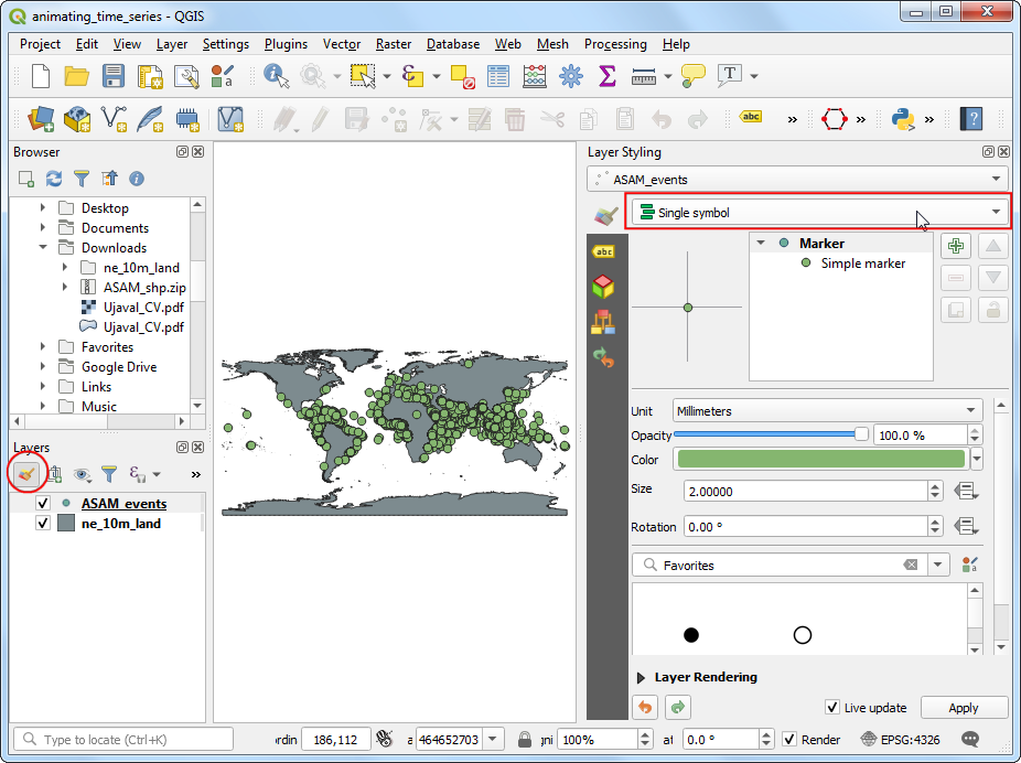
- Once the layer is loaded, you can see the individual points representing incidents of piracy locations. There are thousands of incidents and it is difficult to determine with more piracy. Rather than individual points, a better way to visualize this data is through a heatmap. Select the
ASAM_events layers and click the Open the layer Styling Panel button in the Layers panel. Click the Single symbol drop-down.
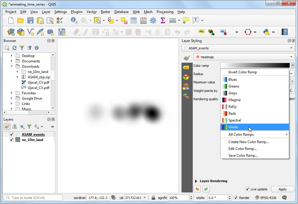
- In the renderer selection drop-down, select
Heatmap renderer. Next, select the Viridis color ramp from the Color ramp selector.
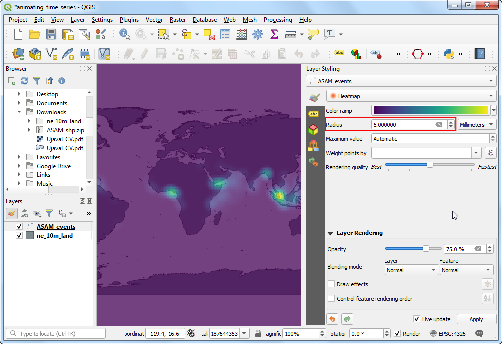
- Adjust the Radius value to
5.0. At the bottom, expand the Layer Rendering section and adjust the Opacity to 75.0%. This gives a nice visual effect of the hotspots with the land layer below.
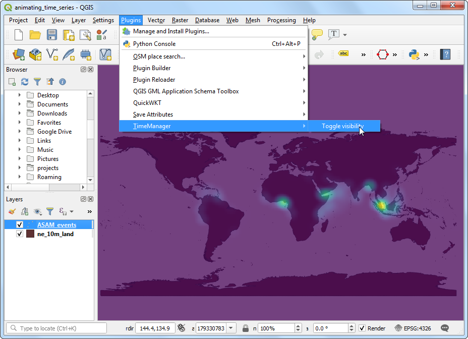
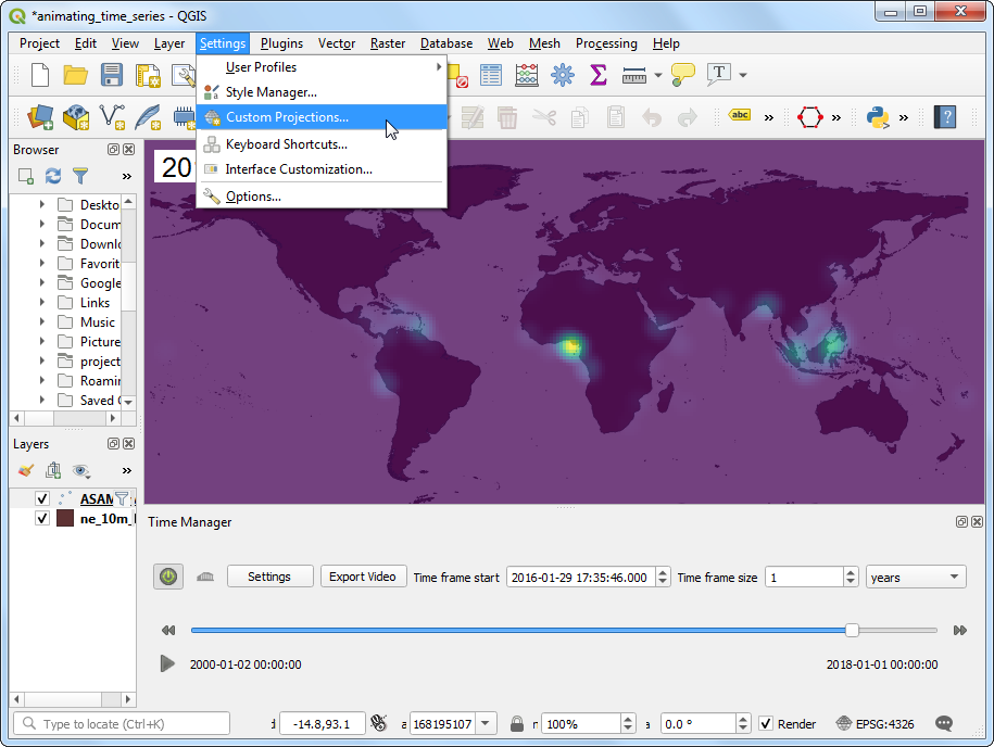
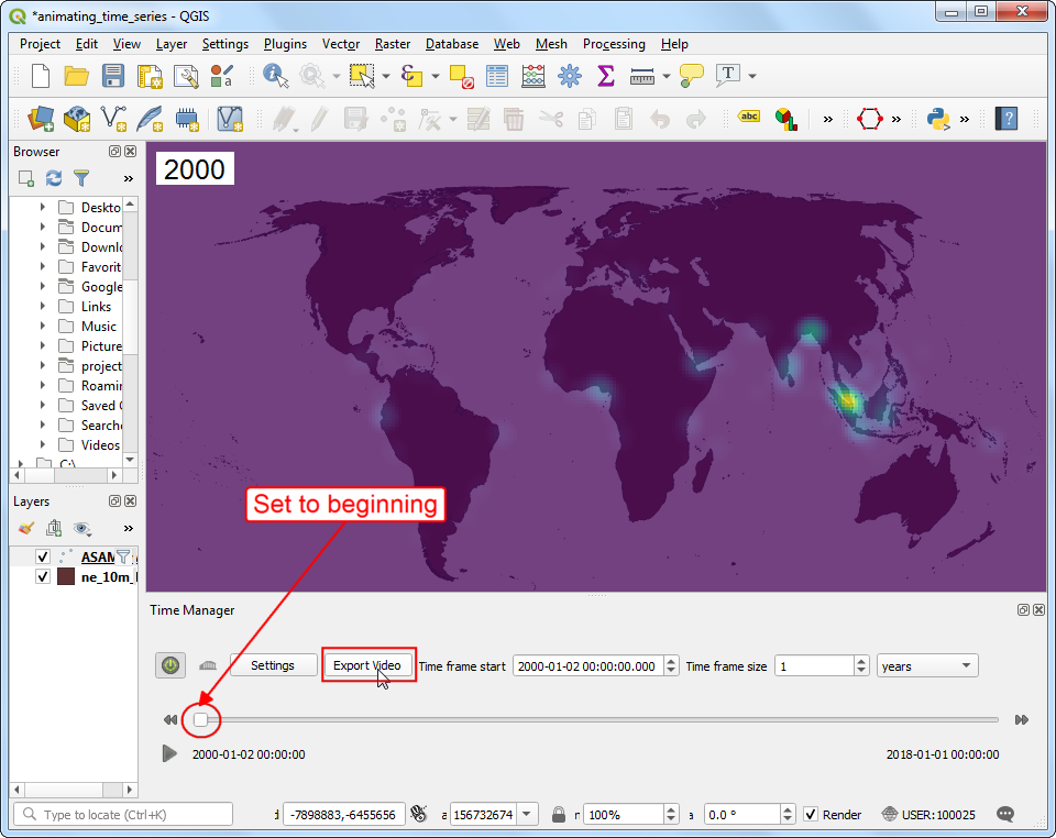
- Now let’s animate this data to show the yearly map of piracy incidents. Go to .
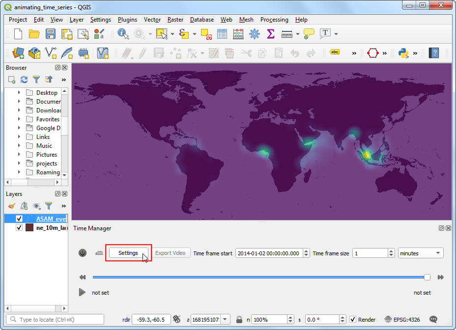
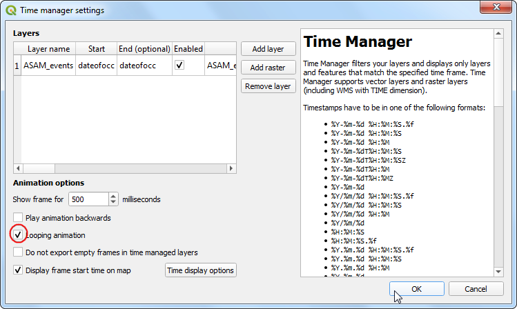
- In the TimeManager panel, click Settings.
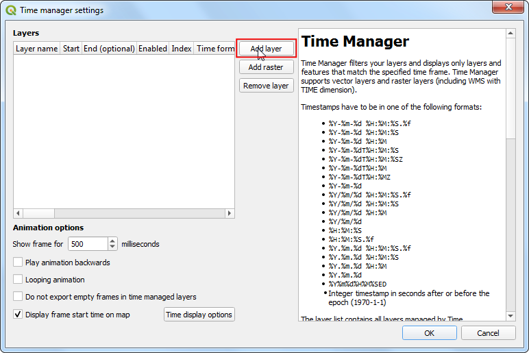
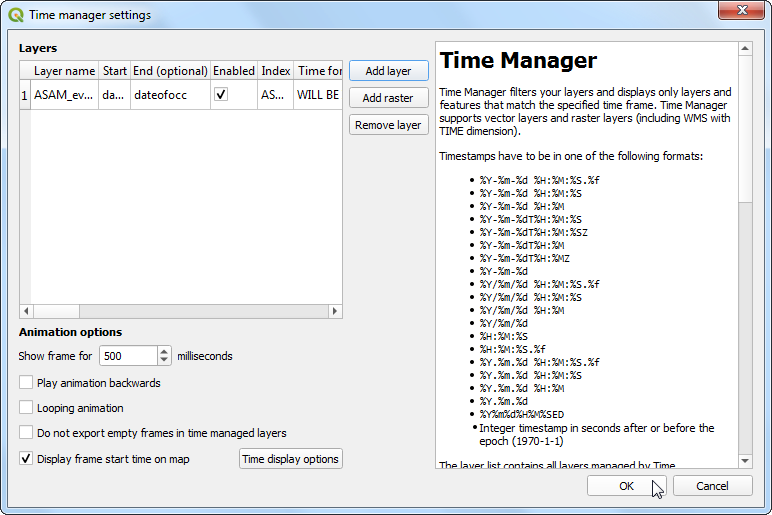
- In the Time manager settings window, click Add layer button.
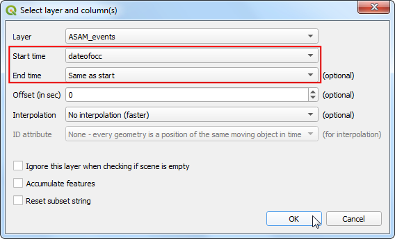
- The source data contains an attribute
dateofocc - representing the date on which the incident took place. This is the field that will be used by the plugin to determine the points that are rendered for each time period. Select ASAM_events as the Layer and dateofocc as the Start time. The End time should be set to Same as start. Click OK.
- Back in the Time manager settings window, click OK.
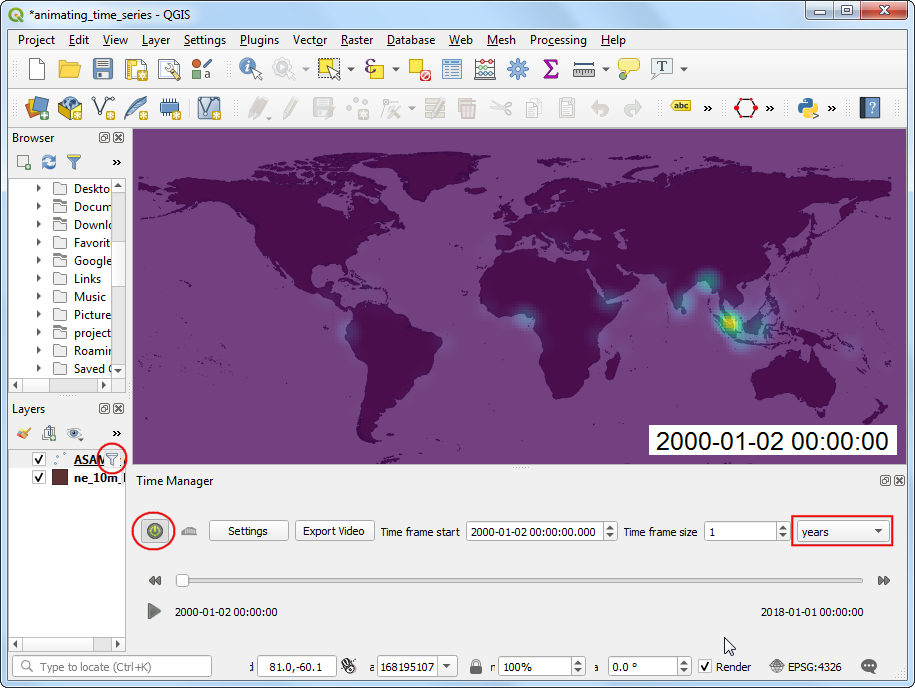
- Click the Power icon in the TimeManager panel to enable the plugin. Set the Time frame size to be
1 years. Once enabled, you will see a filter icon next to the ASAM_events layer. TimeManager works by applying a filter to the layer based on the selected field and specified time period.
Note
As TimeManager works by applying a filter on the layer, it only works with layer types that support this feature. Most data source types do support it - with a notable exception being temporary memory layers. If you had done some processing earlier and have a temporary layer, right-click and select Make Permanent before using TimeManager on that layer.
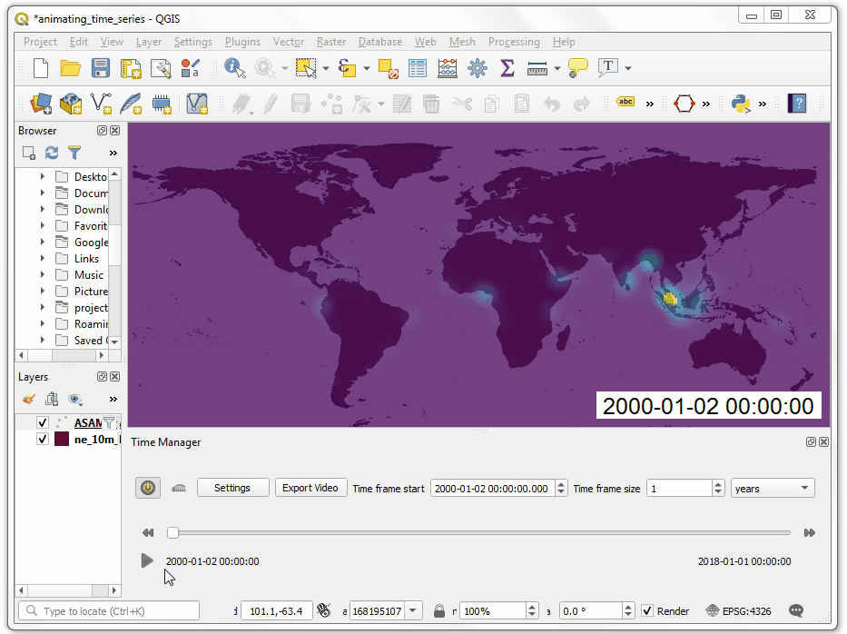
- Now you are ready to see the animation. Click the Play button to see the yearly piracy hotspot animation.
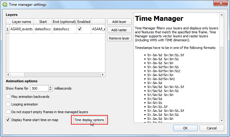
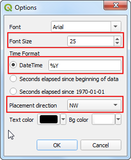
- You will notice that for each frame of the animation, a date is displayed at the bottom-right. Instead of the full date and time, let’s change it to display the year that the map represents. Click Settings in the Time Manager panel. Click Time display options in the Time manager settings dialog.
- Adjust the Font Size to
25. Change the DateTime format to %Y. The time format should be specified in the Python strftime format. %Y is the short-code for a 4 digit year. Also you can change the Placement direction to NW. Click OK.
- Back in Time manager settings dialog, check the Looping animation checkbox. This helps when you are making changes to styling and adjusting styling to make the animation continue playing back from start. Click OK.
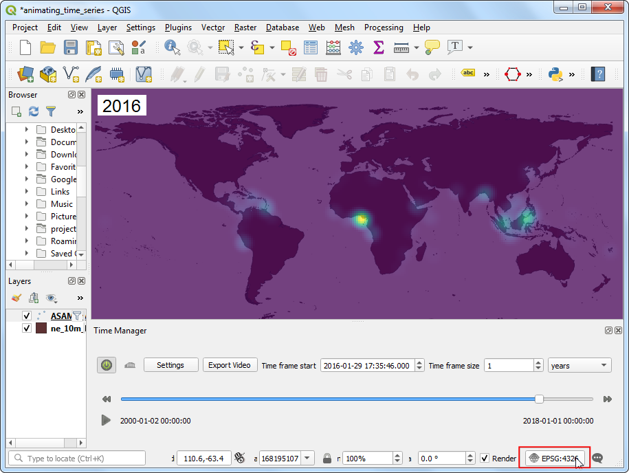
- Now if you replay the animation, you will see the label will show the year of the animation in the top-left corner. At this point, we can export the animation, but there is one more change that we can apply to make our map better. The default map projection is
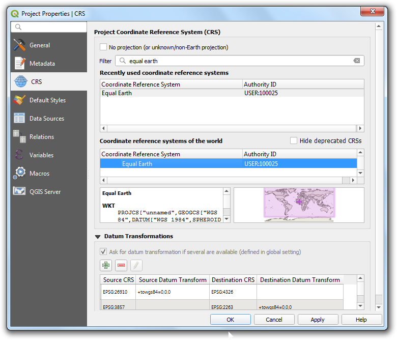
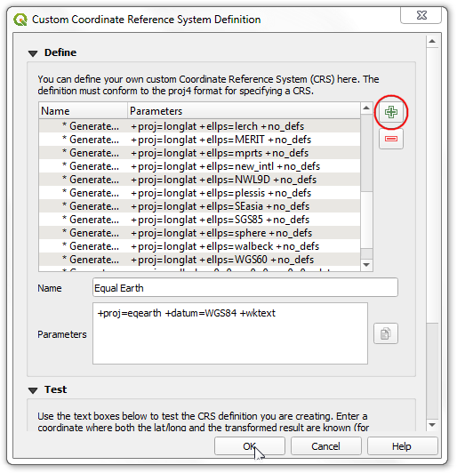
EPSG:4326 which is ok for storing the source data, but not ideal for global visualization like this. I really like the Equal Earth Projection for a visually pleasing and more accurate representation of the world. It is a fairly new projection and not yet available as a predefined option in QGIS. But there is an easy way to use it in QGIS by defining a custom projection. Go to .
- In the Custom Coordinate Reference System Definition dialog, click the + button. Enter
Equal Earth as the name. Enter the following definition in the Parameters box. The parameters need to be specified in the PROJ format. After entering the parameters, click OK.
+proj=eqearth +datum=WGS84 +wktext
- In the main QGIS window, click the Current CRS display on the bottom-right corner.
- Search for
Equal Earth to find and select the newly defined projection. Click OK.
- You will see the map transform to the Equal Earth projection. Now we are ready to export the animation. Before exporting, make sure to set the time-slider in the Time Manager panel to the start position. Export of the animation will start from the current position of the time slider. Click Export Video button in the Time Manager panel.
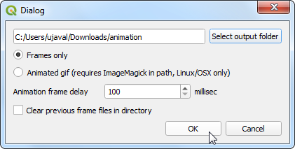
- In the Export Video dialog, click Select output folder and select a directory on your computer. Select the Frames only option and click OK to start the export process.
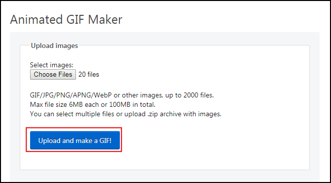
- Once the export finishes, you will see PNG images for each year in the output directory. Now let’s create an animated GIF from these images. There are many options for creating animations from individual image frames. I like ezgif.com for an easy and online tool. Visit the site and click Choose Files and select all the
.png files. Note that the export folder will also have a .pgw file for each frame which contains the georeference information. You may want to sort the images by Type to allow easy bulk selection of only .png files. Once selected, click the Upload and make a GIF! button.
- Once the process finishes, click the Save button to download the GIF to your computer.